Portable devices (tablets and smartphones) have quickly grown from a luxury to a common part of everyday life. Today, every child and adult has at least one gadget with Internet access. Mobile internet usage first surpassed computers in 2016. Since then, this trend has intensified as companies release more and more touchscreen devices. In 2019, over 55% of all traffic came from phones and tablets.
For business owners, this means it’s time to design mobile friendly website in order to attract the largest user base. Although the distribution of traffic for certain resources will vary, rest assured that at least half of them will open your website in a mobile browser. If this category of visitors is not happy with the structure/layout/idea of your resource, you will lose a huge audience of customers.
In this article, we will talk about the benefits of mobile friendly web design and how the right approach increases the profits of the owners of such portals. Also, you will learn about the main features of websites adapted for touch screens and mobile browsers.
That could be your new direction or your lifebuoy!
What does it mean when a website is mobile-friendly?
Now more than ever, users interact with different companies through smartphones and tablets. The days when you had to offer a convenient resource for desktop devices are long gone. Now many business owners are wondering how to design a mobile friendly website because, according to socPub, 57% of users said they would not recommend a brand with a poorly designed portal for portable devices.
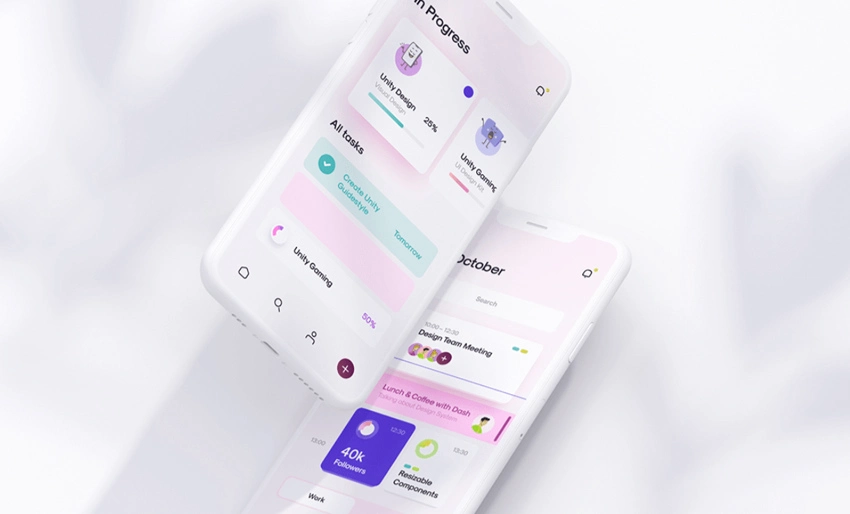
When we talk about mobile-friendly websites, we mean a resource that looks and works great on the screens of our phones. In recent years this solution has become more popular as 90% of users consider this parameter to be critical. Accordingly, many of them will close the page if they cannot find what they need for a long time. Such a website should be sized and coded for an easy interaction on any touchscreen, meaning:
- It is easy to search and read the content.
- It is easy to navigate and jump through pages.
- Fast loading speed.
- Intuitive interface.
- Great user experience.
Designing a mobile friendly website, you need to consider these parameters as a top priority. They influence the opinion of users by determining a quality mobile-friendly resource that attracts new visitors.

The benefits of a mobile-friendly website
Those of you who want to do mobile friendly web page design are probably wondering if they are making the right decision. Well, to answer this question, you should remember the number of mobile users who have access to the Internet 24/7. Besides, a resource adapted to gadget screens provides more advantages than you think.
Great UX
We often find websites that open in a mobile browser, and we see a huge pile of garbage. If visitors cannot easily find information and read texts, it will dash your hopes. Proper use of mobile friendly website design will set you apart from the competition and make a great customer impression.
Fast load speed
Each user who opens your resource has a limited time, so the speed is extremely important. The good news is that such portal loads quickly on devices because its code is written in such a way that it is compatible with tablets and phones.
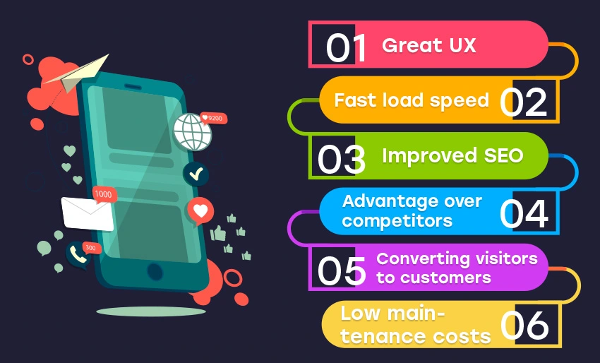
Improved SEO
To be successful in optimization, we need to meet Google’s requirements. The system recommends webmasters to launch responsive sites. If this is not possible, they need to create separate resources to serve a mobile audience of customers. That is a guarantee that your platform will rank well in the search results of Google.
Advantage over competitors
Website design mobile friendly gives you a great competitive edge. If your business is in a progressive niche, visit your competitors’ websites and analyze their strategies. That will allow you to customize your product and grab the attention of your target audience.
Converting visitors to customers
With a website optimized for mobile screens, you will show loyalty and care for users. That increases the likelihood of purchasing products, which will increase your customer base.
Low maintenance costs
Without mobile friendly web design, you have to constantly use time and resources on the site to keep it attractive and convenient. With a mobile design, you can forget about it because all services are automated. In the long run, this will save your budget, and most importantly, you won’t waste a lot of time!
As you can see, the benefits of this approach are clear!
The importance of having a mobile-friendly website
Web design mobile friendly plays an important role in your business, as more than half of customers will visit the site via smartphone and/or tablet. You need to make sure they have a great experience whether they are using an iPhone or Android device. If the resource takes too long to load or the client cannot find the menu options, he will go to the website of another company.
We have already talked about the benefits that you get with a design mobile friendly website. However, there are two key elements that influence user opinion. They require special attention because you can only make a first impression once. Don’t miss the opportunity to convert more visitors into active customers.
Your website needs to be fast
Modern users do not like to wait for sites to load. This trend began after the launch of services such as Uber. And recent research shows that clients leave pages that take longer than 8-10 seconds to load and half of them expect them to load completely in 5 seconds. You can use this chance to get ahead as the average website takes about 15 seconds to display all the content.
Of course, the high speed of your mobile friendly web page design will attract more customers, which will lead to a significant increase in profit. Each client visits the site to solve his problem (buy a product, catch a taxi, and more). The faster he does it, the more positive feedback you will get.
Your website needs to be secured
Unfortunately, there is no sense in web design mobile friendly site if it does not guarantee the safety of visitors. Due to the high incidence of identity theft in 2018, Google started labeling non-secure websites warning desktop and mobile users.
Your customers are probably smart and informed people who are aware of the dangers hidden in unsecured sites. Therefore, they use search engine hints to avoid sites that question the security of their personal data.
How to fix the situation? You should use popular cybersecurity tools and technologies. So, your site with mobile friendly web design should provide SSL and HTTPS certificates that indicate that all information is encrypted and people can use the service without restrictions.
Difference between mobile design and responsive website
What is the difference between mobile-first and responsive approaches to building a website? Which one will be more effective for the business? These are popular questions when it comes to choosing the type of website. We will answer them to make your choice easier!
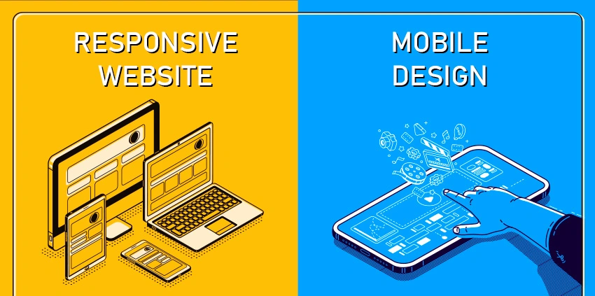
Web design mobile friendly
In fact, this is a separate version of the desktop resource developed specifically for smartphones and tablets. Thanks to the modified code, this website works great on all types of gadgets. Its functions do not change except for the scale, which depends on the screen size of your device. However, some features (navigation drop-downs, for example) can be limited because they are difficult to use on gadgets.
What attracts users to such sites? First of all, they are available anytime, anywhere. The increased download speed will delight every demanding customer and, as a result, that will allow you to outperform the competition.
Responsive design
This type of design changes depending on the screen size of the smartphone. It automatically changes the shape/structure of content, images, and graphic elements. Its functionality is determined by the performance of the device through which you visited the site.
If you want to check how the resource will change on the mobile phone, open it in a computer browser and reduce the size of the window. If the page is not responsive, unfortunately, you cannot visit it on your mobile device.
Such sites are responsive to the user, improving usability regardless of device.
Mobile friendly website design and SEO
The world of digital marketing changed in 2015 when Google announced that the usability of mobile sites was now a ranking symbol. Accordingly, the better experience mobile resources offer, the higher they will appear in search results.
Why is everyone striving for a high rating? This indicator affects the popularity of design mobile friendly website and, as a result, more and more customers visit your resource. Moreover, many of them will buy products and use the services offered.
For SEO, you need to optimize your content and make it easy to view on any device. Do not forget about the high download speed that we talked about in this article many times. All these solutions will help your portal to take higher positions in search engines!
Next steps
The first thing you need to do is to make sure the site is truly mobile responsive. That is an integral part of most types of business and if you are going to be successful, you need to choose a mobile audience of customers.
While designing a mobile friendly website, pay attention to the content layout and its user-friendliness. That is the main secret of success!
FAQ
What is a mobile-friendly website?
That is a resource that looks and works great on the screens of all gadgets. Users can visit such a site wherever they are.
How to make a new website mobile friendly?
Follow simple guidelines, make the main information easy to find, make the buttons larger, and make the font easier to read.
What are the benefits of a mobile site?
Excellent user experience, fast load speed, easy to read information, more customers, and low maintenance costs. All this you will receive thanks to the resource adapted to mobile screens.
Does the site have to be secure?
Yes! That is one of the most important parameters that determine the position of a resource in search engines. Moreover, Google marks portals without HTTPS and SSL certificates as insecure.


