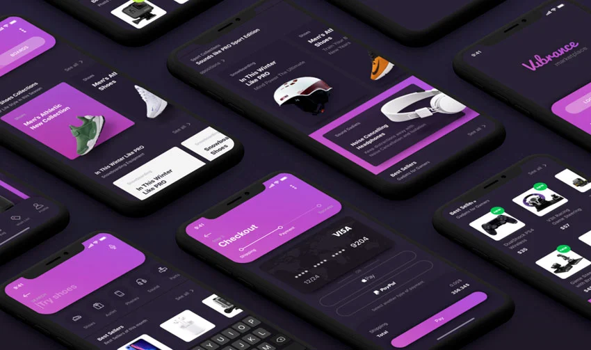
The Internet is growing like crazy and hardly anyone could have imagined its popularity. This has led to an increase in mobile traffic and online service owners are wondering how they can get new customers or create a suitable environment. Perhaps you are one of them because this is an urgent issue.
If so, responsive website development is what you need. This is the practice of creating websites that are comfortable to use on all devices with screens of different displays:
- TV.
- Tablet.
- Consoles.
- Smartphones, etc.
The term was developed and promoted by Ethan Marcotte and today we will look at all its features.
LAYOUTS OF SITES BEFORE RESPONSIVE DESIGN
Before developing responsive websites, programmers had two alternatives: a liquid site that stretches across the entire browser window, or a fixed-width page with a fixed size in pixels.
Both solutions led to the creation of an attractive site with a great user experience on the developer’s monitor. However, the liquid site resulted in a condensed design on smaller screens and extremely long lines and columns.
The fixed-width website was not the best solution for smaller screens optimization either. Also, it has led to a lot of empty space on large screens.
Mobile devices offered a clipped experience, although they were powerful and useful. This meant that the two versions of website building had to be updated and optimized with responsive web development tools.
Flexible layout before responsive design
To overcome the shortcomings of the previous methods, experts have developed several other approaches. Cameron Adams thus wrote a “Resolution dependent layout” post describing a method for creating designs with great usability across all devices.
Flexible layouts mean creating a website layout with a flexible grid that allows it to adapt to any width and height. It’s not possible without proper CSS and JavaScript support.
These were the first steps toward responsive web design and development. Zoe Mickley Gillenwater was instrumental in describing the fundamentals and requirements of flexible websites, offering a combination of fixed size and filled space.
RESPONSIVE WEB DESIGN DEVELOPMENT CONCEPT
Today’s responsive technology for web design is known even to beginners, but many still don’t know its principles. We have identified three main concepts of web development responsive design:
- Mobile-first. When you create a new resource, it will be easier for you to start from the smallest screen. In addition to ease of build, this also tests your content and user interaction with the site.
- One code for multi-publishing. On a responsive site, you write one code and use it for all desktop/mobile devices and browsers. This clearly saves you money and time while the site is up and running.
- Flexible photos and videos. While filling your site with responsive web development tools take care of high-quality graphics. It should look great and be pleasant to watch at 2000 pixels wide.
Adjusting Screen Resolution
Users often face a problem when they randomly resize or change the orientation of their desktops. So, you can reduce its size and accordingly reduce all the shortcuts that are presented on the monitor of your computer or laptop. Moreover, it can also happen on a mobile device. But in fact, this option is quite useful and if the small print and other details bother you – simply increase the screen resolution!
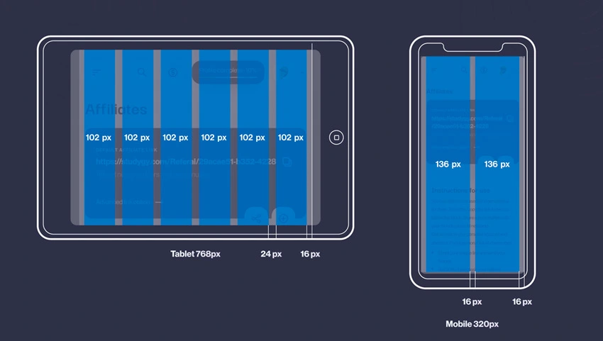
Flexible Grids
Responsive websites are built on advanced flexible grids. This means that by developing a responsive website you don’t need to wonder how it will look on devices with different screens.
While working with this solution you should add in a breakpoint. Then determine the point at which the content starts to look bad and make design changes. For example, if strings shrink as the display enlarges, or vice versa, they stretch.
When responsive web development came along, floating elements were the only solution for creating a layout. They gave each component a certain percentage in width, but the final value did not exceed 100%. It is still used by many internet resources and you will probably find them.
Responsive Images
Marcotte’s early articles describe this approach and its benefits as accurately as possible. You need to select the largest image and then reduce it several times.
To develop a responsive website with this approach you need to be aware of the downsides. First of all, the size of the displayed image can be several times smaller than its intrinsic size. Besides, many users do not want to see such an aspect ratio as on desktop monitors.
Responsive images solve all problems when you use the <img> srcset together with the <picture> element. By specifying several acceptable sizes, you leave the browser the right to automatically select the image that best suits a particular device.
Responsive Typography
This typography approach is relatively new to responsive website development. It controls any changes to the media query fonts for good display on different screens.
Here’s how it works: take the level 1 heading to be 4rem as an example. This heading will be extremely large because it is four times the font size. To use it exclusively on large screens, you need to publish the smaller headline first.
The truth is that these tools are used for many components making them attractive when you’re developing responsive websites.
Showing Or Hiding Content
Be careful when filling your site. Since smartphones do not allow you to display a significant amount of information, you must prioritize content and show it on the homepage. Choose information that can be hidden without risk. To do this, consider the needs of users and solve their problems with simple navigation.
Web development responsive design for a weather forecast website should contain a lot of information. Hiding the pollen count, for example, your resource is dangerous for people with seasonal allergies. Without this information, they are not sure they can go outside without risk. The main thing is you need to satisfy the user’s request and make sure he got what he was looking for.
WEB DEVELOPMENT RESPONSIVE VS. ADAPTIVE OR MOBILE
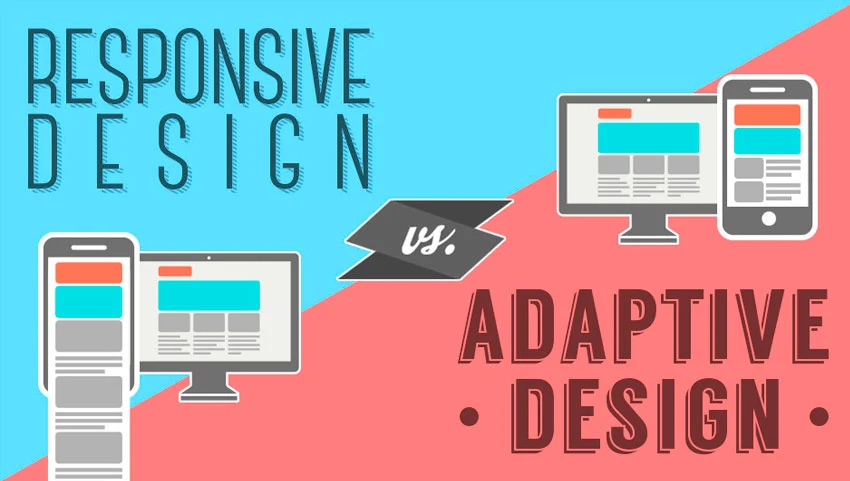
When it comes to responsive web design and development you will find many terms namely “mobile”, “responsive”, and “adaptive”. What is the difference?
Adaptive and responsive are closely related, so they often replace each other. However, the latest often denotes an instantaneous response to any change. In the meantime, adaptive indicates the easy modification of the site depending on the situation. The combination of these terms creates a formula that best characterizes modern sites.
Mobile-friendly generally refers to developing responsive websites that exist on a separate domain. Accordingly, they are intended for owners of phones and tablets. While extremely lightweight, their functionality relies on browser sniffing and codebase.
In 2020, responsive design is at the forefront. Websites are becoming flexible and user-friendly across all platforms.
How to develop responsive web design
It’s simple enough. As this area is evolving rapidly, you will find a variety of tools and guides on how to develop a responsive website and design. But first, define your goals, specialization of the website, potential user, and his needs. Start right from the small touch screen and pay attention to the nuances described above. This list includes headers, content, and so on.
How do I make my website Responsive?
Many online users are always wondering how to develop a responsive website and what they need for this. And although at first glance it seems a little horrible, it is a simple and fast enough process if you know where to go. Here are 3 easy steps overview:
- Start by creating a non-responsive layout with the default size.
- Choose suitable media including photos, images, and videos.
- Make sure the typography of the responsive website is easy to read on any screen.
Well, now you know everything about developing a responsive website. Get started now!


