Mobile first design – new era of web development
Over two billion people (50% of all users) around the world have access to the Web through smartphones, Invision.com claims. According to forecasts of experts, their number will reach 72% by 2025. Therefore, if you do not develop mobile solutions for your clients, you are in big trouble.
For this reason, mobile-first responsive design is an effective, popular, and useful strategy for different apps, websites, etc. Google and other well-known brands have long chosen mobile devices as their main reference points and you just need to follow their example to succeed.

WHAT IS MOBILE-FIRST WEB DESIGN IN 2020?
Before you understand how it works, you first need to understand what responsive design mobile first is. It is a new design philosophy that strives for the best experience and performance on small-screen devices: phones and tablets. Modeling, designing, and creating such prototypes will help you grab the attention of clients by providing them with a great experience.
Here’s how it works: the designer sits down at the prototype or sketches the layout of your site. However, he imagines how it will look on mobile gadgets. After that, he switches to bigger screens and not vice versa.
The mobile-first responsive web design term was first used by Eric Schmidt, then-CEO of Google, at an international conference in 2010. He focused on mobile-friendly architecture and was confident that smartphones would replace most computers.
One of the main advantages of this strategy is limited space, in his opinion. You can’t fit all the details on the touchscreen, so you optimize those that are most useful to the user. Surely, the design will expand along with the number of options, but you always know which ones will be at the forefront. The philosophy remains the same to this day.

Why is it important to use web design mobile-first?
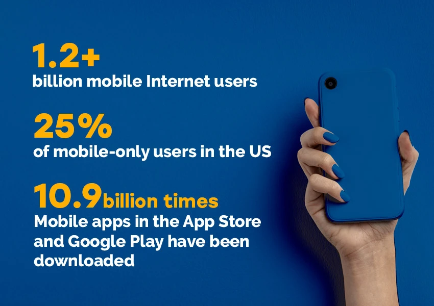
In the minds of millions of people, the computing-friendly environment remains the most popular and they are not trying to break out of this box. If you are reading this you are on the right way and you are probably ready to embrace the mobile-first design strategy. To be sure and trust us, take a look at the CRAZY numbers provided by Design Shack:
- 1.2+ billion mobile Internet users.
- 25% of mobile-only users in the US.
- Mobile apps in the App Store and Google Play have been downloaded 10.9 billion times.
- Phone and tablet sales are increasing in every country and over 85% of gadgets are connected to the Internet.
So, responsive web design and a mobile-first approach with good user experience on phones increase the likelihood of your discoverability. Continuing this thought, we would like to note the increased number of new customers who use your services. It does not depend on whether you offer the site in the browser or the installed application.
The Internet exists as a trend that is growing every second. This is a huge industry that fits in your pocket. An amazing revelation, isn’t it?
HOW TO DESIGN MOBILE-FIRST?
When you look at the mobile-first design process, you will find many key elements that make your proposal convenient and attractive. Since you are trying to please customers, you need to do everything at the highest level.
The procedure starts with the right digital tools which are the basis. When choosing a builder or framework, consider popular solutions like Foundation, Skeleton, Bootstrap, or any other packed with web development mobile first details.
When you decide to build something from scratch, create templates, and identify the main elements (sections, blocks, search strings) that will improve the experience, and save your clients’ time. Customize them to best-fit handheld devices. Why don’t you put a call-to-action in the navigation, for example?
Buttons and links for use must be clear and easy to click. Following Android Material Design principles, they should be at least 48×48 dp which is equivalent to 9mm in physical size. Probably your mobile-first website design includes a registration button. In this case, it should be larger by default and the procedure itself is easy.
Last but not least, your “customer’s pain” points. This is covered in all articles and tutorials.
Find out what problem the user came to your site with and offer an instant solution. He will look for a solution in each section of your design for mobile first. If the page does not fulfill this function, do not add it to your site.
Think about how the user interacts with the interface and find ways to speed up and improve it. Remember that everyone is all looking for convenience and good usability, therefore, you should always look for ways to improve the site and/or application.

TIPS AND TRICKS FOR GOOD MOBILE-FIRST DESIGN
Choosing tools and identifying customer needs are the basics that will help you create a quality product. However, we offer some tips that will greatly speed up and simplify this procedure.
Mobile platforms have many features that can play against you if you don’t know how to use them correctly. Their descriptions are presented in the following sections.
Mobile-First = Content-First
When it comes to web development mobile first, you need to remember the main role of content. The only thing you have to offer users is the content they are looking for. Anything else will interfere and even annoy them.
Experts always focus on the limited size of touchscreen displays. This means you need to analyze all the content you are going to add to the site and select its main parts. Additional information will always be on your site, but first, the user wants to see what he needs right now with fast loading.
Take the Chicago Tribune for example. It is one of the first newspapers to introduce a mobile-first website design. Having opened it on any phone, you will find a competent strategy and its effective implementation:
- The name of the newspaper is recorded at the top.
- The main news is immediately offered to visitors.
- Pop-up saves a lot of space.
- Navigation buttons on the landing page.
Did you know that 90% of users make a decision after watching a video? This is a great addition to your resource. The video is great for any kind of task, business, and industry in general.
You can tell the story of your business, present a product, or describe the competitive advantages of your service. This is also a solution for content optimization tasks and attracting new consumers.
Make it easy to navigate
Too many secondary elements? Use the hamburger menu, one of the best solutions for creating easy-to-reach navigation keys. Mobile first responsive design has enough secrets and benefits.
The hamburger menu is a recognizable way to access secondary elements. Users are always looking for such buttons because they know how convenient they are. But this comes with low engagement.
Analytics research by the Nielsen/Norman Group found that hidden buttons reduce content accessibility by nearly 21%. Moreover, it increases the navigation search time by two seconds.
An experienced mobile-first website design consultant, Joe Toscano talks about the effectiveness of combo navigation. Instead of looking for switch buttons and hamburger menus, the customer just needs to scroll down the page for a complete list of services and sections.
Apple’s website is one of the clearest examples where instead of a hamburger menu with hidden options, the company offers the most important links with easy access.

Good mobile web design
Good design for mobile first is always simple. The owners of popular mobile sites and applications never burden their visitors with ads, spam, and secondary details they don’t want to see on small screens.
You don’t have a lot of space, so it makes sense to limit it to only the information you need. To understand how this works, check out a few blogs like ours. They are focused on their target audiences by solving the problems of a specific category of users.
Responsive design mobile first exists for the convenience of Internet surfers. Think about what goals they pursue by visiting sites like yours. View your product and give an honest answer – can it solve all the problems? If even one page doesn’t add experience, you should leave it on the table.
Forget about banner ads and pop-ups. Not this time!
Mobile-first vs Responsive design
Some users are wondering how this all relates to mobile-first responsive design. This is another strategy for exciting virtual space in 2020. However, both resolution strategies are not competitive, on the contrary, they complement each other.
The responsive design focuses on media queries concept helping online website and app owners define device-specific and viewport sizes. So, using responsive design mobile first allows you to code your initial CSS (with mobile reference) using media queries. You can also handle additional styling as the viewport expands.
Despite the different forms, the algorithm of responsive design remains the same: you start with small monitors and then enlarge them. There are many arguments for both strategies and you need to choose what will work best for your project.
WHAT ARE THE SHORTCOMINGS OF MOBILE FIRST DEVELOPMENT?
No one strategy is perfect when it comes to surfing the Internet. Therefore, the mobile-first design process has some disadvantages that require your attention:
Everything looks different
Nobody said that mobile design would be easy and fun. Therefore, you need a team of technology experts who know all about the differences inherent in this approach. This process requires new solutions, methods, and experiments.
From small screens to large ones
Many designers find it difficult to start with touchscreens as they get used to large desktop monitors. There are many constraints to consider when developing a mobile-first design strategy. You will face bigger headaches and fewer tools. All rules should be taken into account if you do not want to create the same type of resources presented at every step.
Trusting relationship
During the session, the client will not see and evaluate the desktop site. Therefore, it is important to gain trust between the user and the designer. Every client wants to see something new and you should display your ideas, thoughts, and goals on the landing page.
What are the main ideas for using mobile-first responsive web design? It’s time to summarize:
- First mobile design is a popular philosophy for a better experience.
- There are 1.2 billion Internet surfers in the world who have chosen phones.
- To be successful, prioritize content and provide easy navigation.
- It won’t be easy, especially if you’ve only worked with desktop devices before.
Mobile-first is one of the hottest trends in 2020. It catches the attention of both small sites and platforms of large corporations looking to attract more clients.
